Using Heatmaps to Understand College Registration Activity
By Brian Moss| August 10, 2020
Knowledge of student registration patterns can assist higher education institutions make decisions about issues such as staffing levels, technology infrastructure, and verdicts about class cancellations. It is common for institutions to track daily counts of the number of students who have registered (i.e., headcount) and the total number of credit hours enrolled.
To provide some context, daily headcount and credit hour tallies are commonly compared to the previous year’s tallies to determine if there has been an increase or decrease on comparable days.
A typical table might look like:
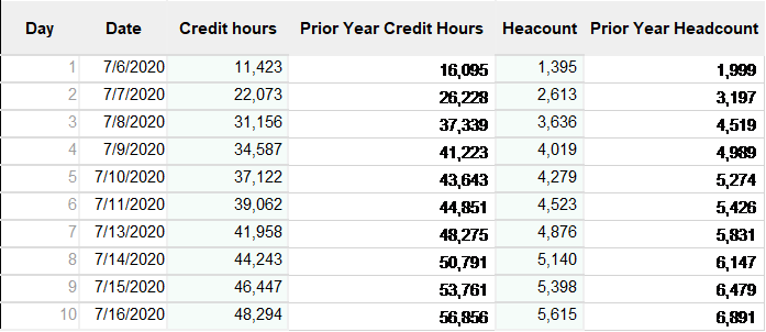
Tabular data like these are hard to read and make it difficult to detect periods of increased or decreased registration activity. Line charts might provide some idea of registration trends but trying to visually gauge the change in line slopes on a daily basis is almost impossible.
One potential solution is to create a heatmap to visualize the magnitude of change that occurs across time. Within a two-dimensional surface, the heatmap uses color intensity to identify degrees of change. Depending the scheme used, the color used for a given data point signifies a rise or decline in counts relative to all the other data points. One common approach is to use a range of colors from blue (cooling off of activity) to red (heating up of activity).
After creating a database that contains all daily registration data from 2016 to 2019 and ongoing registration for the current semester, the following heatmaps were created. The first heatmap represents daily change in activity for student head count, the second displays credit hours.
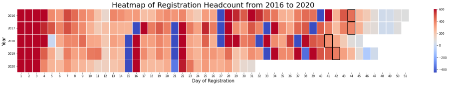

Each heatmap includes three variables. Rows are year, columns are day of registration and each cell represents the number of students or credit hours added (or lost) for a given day. Cells are color coded by the scale presented on the right side of the heatmap. Specifically, red indicates an increase, blue indicates a decrease, with the intensity of color representing magnitude (darker colors mean more extreme counts).
Now that these data are graphed there are some clear patterns that emerge. First, the first few days of the registration are consistency active. Enrollment is relatively steady up through the day students are dropped from classes due to non-payment (indicated by dark blue cells, when headcount and credit hours drop significantly). Enrollment consistently spikes the day following each deregistration day (dark red immediately following each dark blue).
Days highlighted with a black box are the first day of classes for the semester for the given year. The few days leading up to the first day of the term are quite active, with a significant number of students registering. Then, once classes start headcount and credit hours cool off drastically (this is typically the schedule adjustment period).
Although heatmaps have a broad range of applications, they can be particularly useful to understand student enrollment patterns. The identification of ‘hot’ registration periods can provide insight into when college resources will likely be in demand (e.g., academic counseling and financial aid). Hot periods just before the beginning of the term provides data to help support the delay of course cancellations for classes that are close to meeting the minimal enrollment required by the institution. Periods consistently ‘cold’ identify time periods that are ripe to experimental interventions (e.g., recruitment or offering incentives).